To Serif, or Not to Serif.
The Folger Shakespeare Library and I go way back—about 30 years, actually. I first visited in high school, when Shakespeare, First Folios, and centuries-old books were the main attraction. Coming back decades later, I found myself looking at everything differently.

This time, my designer brain took over, zeroing in on letterforms, elaborate drop caps, woodcut illustrations, decorative borders, beautifully imperfect printing, and page compositions created hundreds of years before anyone could argue about whether the logo needed to be bigger.
This is where the Folger gets interesting—not just as a literary destination, but as a designer’s dream.
Because before Figma, before Adobe, before Pantone books and brand guidelines and the undo button, designers were already wrestling with many of the same things we are: How do you organize information? Where does the eye go first? How do words and images work together? How do you make something useful feel beautiful?
The answers are sitting inside books that are four and five centuries old.
And they are gorgeous. And imperfect.
The Original Design Systems
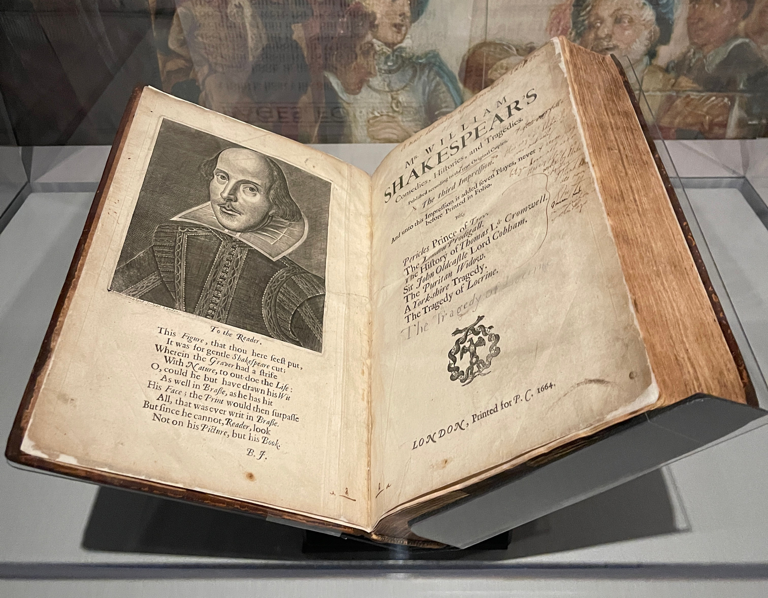
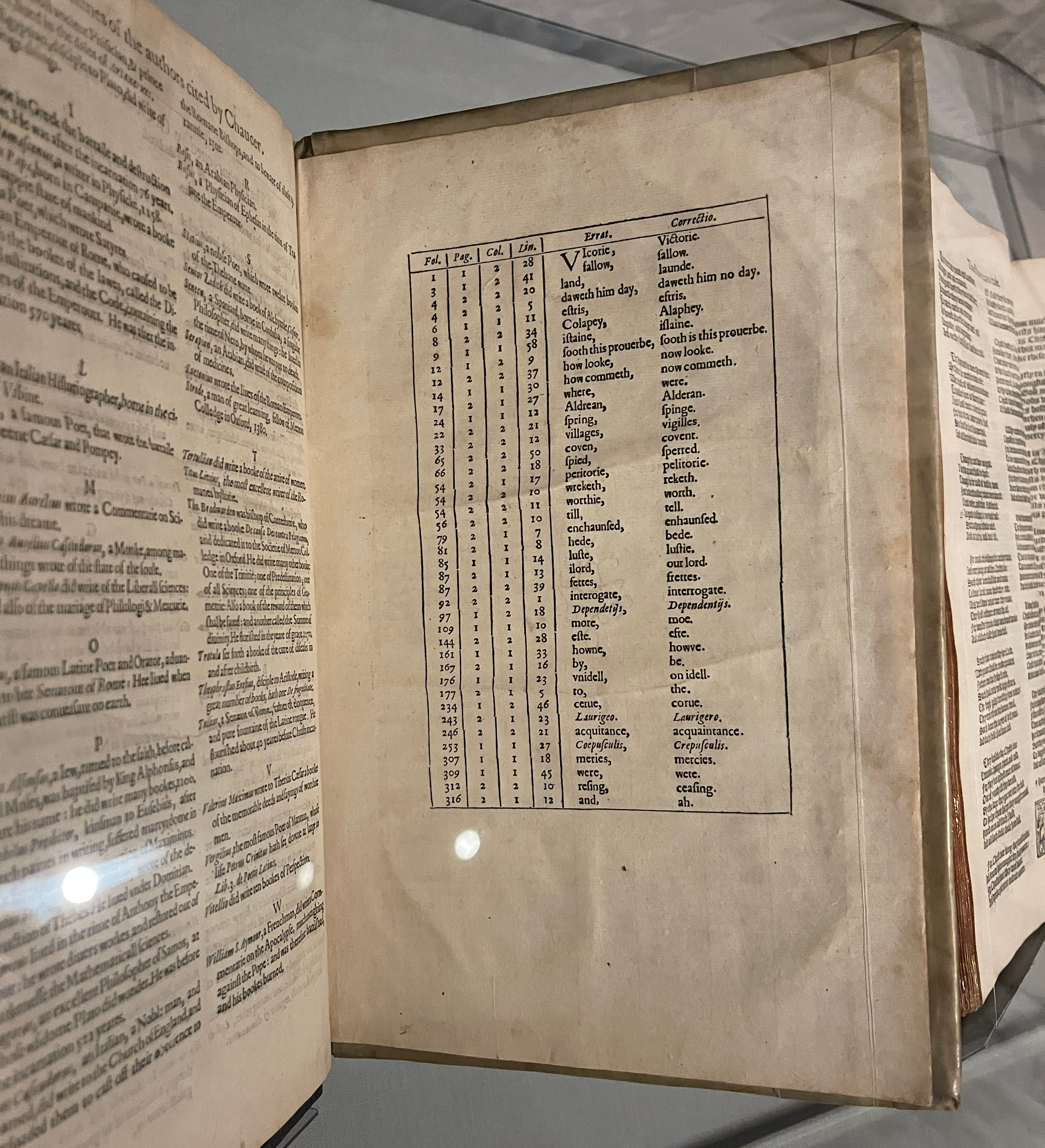
Spend enough time looking at books from Shakespeare’s era and something becomes obvious: graphic design didn’t suddenly appear when Helvetica came about. Printers and illustrators were already building sophisticated visual systems out of type, ornament, spacing, scale, symbols, borders, and imagery. A single page might contain several type sizes, an illustrated initial, decorative flourishes, handwritten marginal notes, and enough typographic personality to make a contemporary minimalist designer break into a light sweat.
And somehow, it worked.
What I love most is that you can still see the hand in it. Letters aren’t always perfectly aligned. Ink behaves like ink. Illustrations have quirks. Spacing can be strange. Nothing feels mathematically optimized. It feels made.
That imperfection is part of what makes these objects so beautiful. We spend an enormous amount of time today trying to make design consistent, scalable, responsive, repeatable, and pixel-perfect. Here are pages that have survived for hundreds of years precisely because they possess something harder to systematize: character.

Before the Mood Board
The illustrations were what really got me.
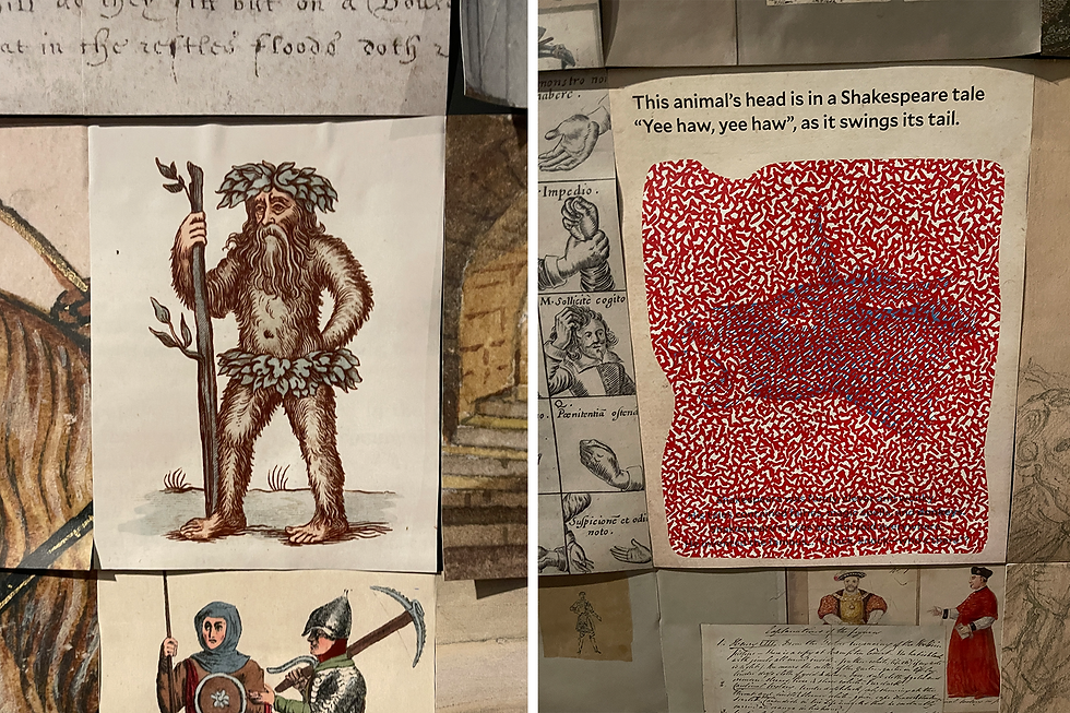
Woodcuts, engravings, botanical drawings, maps, diagrams, strange little characters and decorative flourishes appear throughout the collection, sometimes functioning as information and sometimes seemingly there because somebody decided the page needed a little more life. Which, frankly, I support.
Looking at them now, it’s impossible not to recognize the same creative instinct behind contemporary illustration: take an idea, reduce it to an image, give it personality, and make someone want to stop and look.
The technology has changed dramatically. The impulse really hasn’t.
400 Later, We're Still Moving Type Around
That may have been my favorite part of visiting the Folger. For all the tools we’ve invented and all the terminology we’ve piled onto the creative process, some of the fundamental questions of design haven’t changed much.
We’re still arranging words on a page. We’re still deciding what deserves emphasis. We’re still combining language and imagery to communicate something. We’re still trying to make information understandable without making it boring.
And occasionally, we’re still adding an unnecessary decorative flourish simply because it looks fantastic.

Beautiful Little Pieces of the Folger
On my high school visit, I spent some of the little pocket money I had on a postcard I thought was beautiful. I kept the "A Midsummer Night's Dream" postcard for the next 30 years. So, naturally, when I returned to the Folger, I had to add a few more to the collection.
These aren’t ordinary glossy gift-shop postcards. They’re letterpress printed the old-fashioned way, with hand-mixed ink rolled onto raised blocks and type, then pressed directly into paper. You can actually feel the impression left behind—which, in our increasingly frictionless digital world, makes them feel even more special.
The First Folio cards are the work of Louisa Hare, who grew up just a few miles from Stratford-upon-Avon and studied both art and English before finding a way to bring the two together through printing. While working at an antiquarian bookshop in Stratford, she discovered a reproduction of Shakespeare’s 1623 First Folio and became fascinated by its typography and ornamentation.
Hundreds of years later, those same letterforms and illustrations are being given another life through the same wonderfully physical act of putting ink to paper.
And apparently, I’m still buying them.

The Pentagram Touch
With all this history, it would have been easy for the Folger’s identity to reach for the obvious: an ornate Blackletter letterform pulled straight from an old manuscript. Instead, the Folger “F” feels surprisingly modern while still belonging to the place.
And there’s a reason. Pentagram looked not to Shakespeare’s books, but to the Art Deco lettering engraved on the Folger’s own 1932 Puck statue. That lettering became the inspiration for Puck Headline, a custom typeface developed with Tobias Frere-Jones, with its distinctive “F” pulled out to become the Folger’s mark.
What I especially love is how much work that one letter can do. It’s a logo without being trapped inside a logo. The “F” moves easily from signage and wayfinding to event graphics, publications, and merchandise, while the larger type system can stretch and change around it. It feels classic without pretending to be 400 years old—and modern without ignoring everything that came before it.
The Folger is surrounded by extraordinary examples of historical typography, so not making the identity faux-Elizabethan is actually the more interesting design decision.

Some Things are Worth Preserving
So yes, the Folger Shakespeare Library is absolutely a literary person’s dream. Go for Shakespeare. Go for the history. Go because standing inches away from something printed hundreds of years ago does strange things to your sense of time.
But if you’re a designer, illustrator, typographer, art director, or simply someone who notices when an ampersand is particularly good, look closer.
There are hundreds of years of creative decisions sitting right in front of you. Turns out, we’ve been going Off Brief for a very long time.

Comments